Here's something cool that I thought I would share. When we first started developing our app, we just tried to get everything on screen! We quickly chose a font and a background image just so we could see what it looked like. Admittedly, it didn't look very nice.
 |
Early Attempts...Yikes!
|
 |
Color Palettes
|
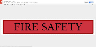
Since then, we made some classier buttons on Google Drawings and chose a color palette that worked with the background image using colourlovers.com. We especially liked "cheer up emo kid" by electrikmonk. The buttons were modeled after fire house signs, and we tried to get the font to match.
 |
| Nice |
Here is the result! We think it's a lot more fun and kid-friendly. Hopefully we can make it look even nicer in the future!


No comments:
Post a Comment